AI app EPIK hits No. 1 on the App Store for its viral yearbook photo feature

AI app EPIK hits No. 1 on the App Store for its viral yearbook photo feature Sarah Perez @sarahintampa / 8 hours

Another week, another AI app going viral. This time around, the AI app that has surged to the top of the App Store is EPIK, an photo editing app that lets users generate nostalgic, 90s-inspired “yearbook” photos of themselves as one of its many templates. Similar to other recently popular AI apps, EPIK works by having users first upload a series of selfies which EPIK then uses to generate the throwback yearbook photos featuring the user in different poses, with different looks and hairstyles.

The app hails from South Korea-based Snow Corporation, a Naver subsidiary, which also makes the AI profile app Snow. In recent weeks, EPIK has gained traction on the App Store as influencers from around the world began sharing their AI-generated photos across social media.

On the U.S. App Store, EPIK is now No. 1, though it’s not quite as popular on Google Play at No. 37.

Image Credits: EPIK

According to data from market intelligence firm Apptopia, EPIK has seen a total of 92.3 million lifetime installs since its August 2021 debut, including 4.7 million downloads in the U.S. However, the app started to gain traction on September 19th and then popped even more 10 days later, the firm says.

Currently, EPIK’s largest market is India, by downloads, and the U.S. is number 6.

Another firm, data.ai, sees slightly lower lifetime downloads at 82 million and notes the app has generated close to $7 million in consumer spending. This is the first time it’s ever ranked in Top Overall apps in the U.S., data.ai also notes.

Snow Corp. did not return a request for comment to verify these figures.

Scrolling the #epik hashtag on Instagram reveals a number of larger accounts have been joining in the trend of posting their AI yearbook photos, including beauty influencers like Samantha Batallanos (254K followers) and Bretman Rock (18.8M followers), actor and rapper Tim Chantarangsu (1.5M followers), fashion model Eva Mikulski (481K followers) video creators like Denyzee (526K followers), Missou (507K followers), Romy (1.5M followers), Liz Rangel (1.5M follower) and Hila Klein (1M followers), Twitch streamer Pokimane (6M followers), and many others — including influencers from the app’s home country and elsewhere in the world.

Image Credits: Pokimane on Instagram

To use EPIK’s Yearbook feature, users upload 8-12 selfie images which are then used to create the AI photos.

The app warns users that EPIK’s AI is constantly learning to improve its results and not all the AI results will be “satisfactory.” If you continue, it says, “you will be deemed to have agreed to the outcome,” the message states.

The app also suggests that users submit clear photos with a diverse range of expressions, angles, and backgrounds. After the app processes the photos it outputs 60 different images. While the app itself is a free download, users do have to pay for the AI output. They can also choose to pay to have the images generated more quickly — standard delivery ($3.99) has wait times of up to 24 hours, while express delivery ($5.99) offers photos in under two hours.

Image Credits: EPIK

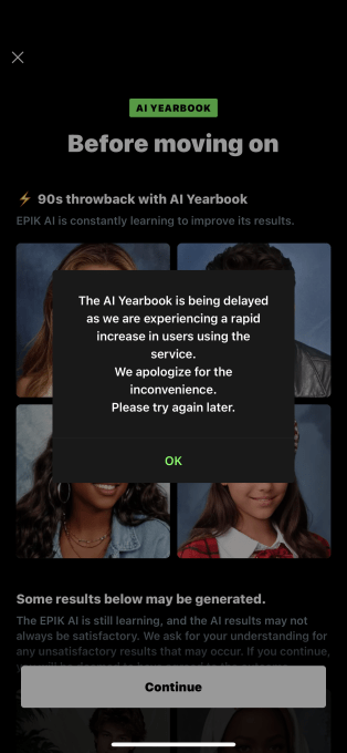
Unfortunatley for EPIK, the app has become so popular it can’t keep up with demand. If you try to use the Yearbook feature now, the app may say it’s being delayed “as we are experiencing a rapid increase in users using the service. We apologize for the inconvenience. Please try again later.” Even if you get through the selfie upload process, the app may inform you the delivery options are “sold out” and to try again later.

Image Credits: EPIK

EPIK is not the first AI photo app to go viral for a clever feature that generates outsized attention. It follows other viral hits like Lensa, which offered AI-generated “magic avatars” and Remini, which hit the top of the App Store this summer for its professional-looking AI headshots. But many of the AI photo apps aren’t able to maintain traction after their 15 minutes of fame wears off. A report from Apptopia released earlier this year found that the initial group of AI photo editors that began taking off last winter, had already lost consumer interest.

For EPIK, that means its recent high status may ultimately be another flash in the pan as users move on to the next AI trend.

Data Visualization: Presenting Complex Information Effectively

The purpose of data visualization is to present complex data in a way that is clear to understand and engages audiences. Visualizations make it easy to convey an overall message, highlight key insights, and can be very persuasive in terms of guiding an audience toward a conclusion.

In this article, we will consider how to present complex information effectively with data visualization in a simple five-step guide, we will also discuss its benefits and provide a few use case examples.

What is Data Visualization?

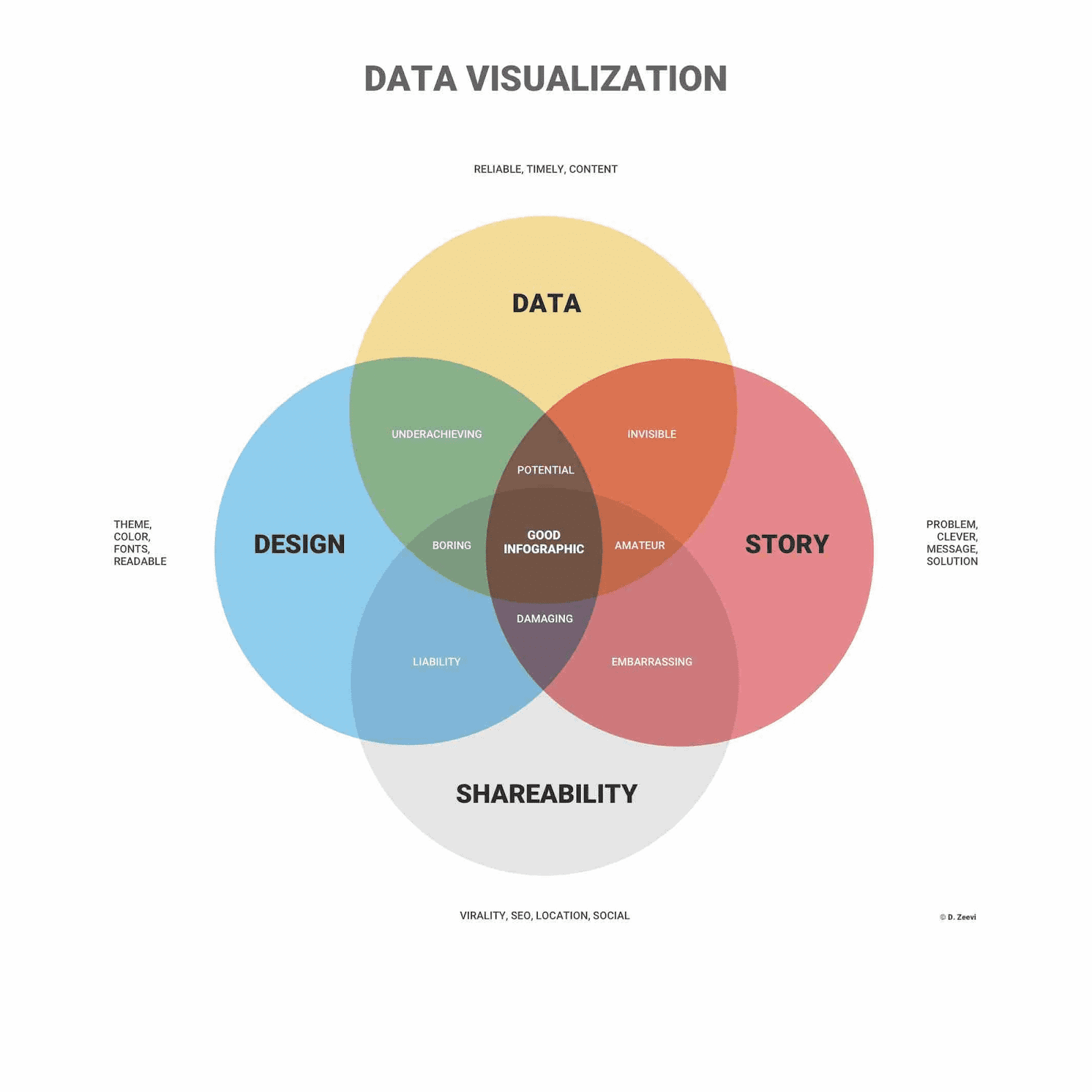
Data visualization represents data and information in a graphical way that is easy to comprehend. Visualizations can include charts, maps, graphs, infographics, and other elements that help to simplify data. This makes it easy to identify patterns and trends, spot inconsistencies and outliers, and help an audience conclude the data that is being presented.

Data Visualization: Presenting Complex Information Effectively
Image from infogram

Data visualizations are also very effective when it comes to presenting complex and potentially confusing data to non-technical personnel within a company. This can assist key decision-makers when it comes to signing off new projects or allocating more of the budget to a certain department, for example.

What are the Advantages of Data Visualization?

As humans, our eyes are immediately drawn to patterns, colors, and shapes and we can instantly differentiate between certain elements. Branding and logos of big businesses are prime examples of this, with almost everyone around the world able to identify a big yellow ‘M’ or the outline of that famous apple.

Data visualizations are based on these human perceptions, grabbing the audience’s interest and keeping people focused on the message. Used effectively, data visualization can be an amazing storytelling tool, leading the audience on a journey in an engaging and persuasive way.

As previously discussed, data visualization is very effective at turning complex and confusing data into something more digestible and easy to understand, especially if it is being presented to non-technical people or an audience that is not familiar with the subject.

Visualizations also make it possible to analyze big data, data that is so large, complex, and

fast-paced that it is impossible to process using traditional means. This presents new opportunities to businesses, allowing for new insights and trends to be discovered, and providing a competitive edge.

Other key uses of data visualization include visualizing relationships and patterns between two elements, sharing key information quickly, and exploring new business opportunities in an interactive way.

The Challenges of Data Visualization

To fully understand data visualization we cannot just focus on the advantages, we also need to look at its limitations to determine when and where it can be used.

One disadvantage that is more user error than a fault of the technology is the possibility of making inaccurate assumptions when there are a large number of different data points. Inexperienced users may also choose a poor or incorrect design, visualizing the data in a way that confuses the audience or implements too much bias.

Another issue that needs to be avoided is automatically believing any correlation can be linked to a cause. Of course, in many cases, correlation does represent a valuable insight or trend, but not always, coincidences do happen.

Finally, it can be sometimes easy to become embroiled in the fancy graphics and interactive charts, losing sight of the key message and the overall goal of the visualization. Like any type of reporting and presentation technique, the focus is crucial to deliver the key messaging effectively.

Data Visualization: Use Cases

Now we understand what data visualization is, its benefits, and what to avoid when designing and delivering a report, let’s consider how it can be applied with a few common use cases.

  • Data visualization can provide advanced marketing analytics to help drive decision making, discover new trends and niches, while also improving current campaigns. Data could include website traffic and page performance, helping to fine-tune web content to create more conversions.
  • Risk management can also rely on data visualization to quickly highlight any issues within business operations or cybersecurity, for example. By analyzing historical data and presenting it in an engaging way, risks can be easily identified and mitigated before they cause any disruption.
  • In sales, CRM tools enable businesses to present data in a visually engaging manner, simplifying comprehension for both internal teams and customers. Moreover, there are specialized CRM tools tailored for very specific industries. For instance, roofing contractors can leverage roofing CRM software instead of generic options. This bespoke approach ensures that data visualization becomes accessible and applicable to a wide range of businesses.

Effective Data Visualization in 5 Steps

Using data visualization effectively can be relatively straightforward if best practices are adhered to and the purpose of the data analysis and who it is being presented to is clear.

Here are five steps on how to present complex data effectively with data visualization.

1. Determine Who The Audience Is

The first step when creating a data visualization is to fully determine who the audience is, their knowledge level, and their technical expertise. If you know the individuals well then you may also have an understanding of their general attention span and their interest in the subject.

For a data visualization to be effective you must fully understand the expectations and goals of the audience and deliver the data in a format and design that suits their needs.

2. Remove Unnecessary Complexity

When designing a data visualization, simplicity is critical, removing any unnecessary elements that could distract or confuse the audience. The overall message should be abundantly clear, without any clutter. To achieve this, implement an eye-catching and consistent color scheme, clear and suitably-sized fonts, and utilize white space, grids, and margins to organize the page layout. Large titles, legends, and labels can also help to explain the content more clearly.

3. Use Relevant Charts

Data Visualization: Presenting Complex Information Effectively
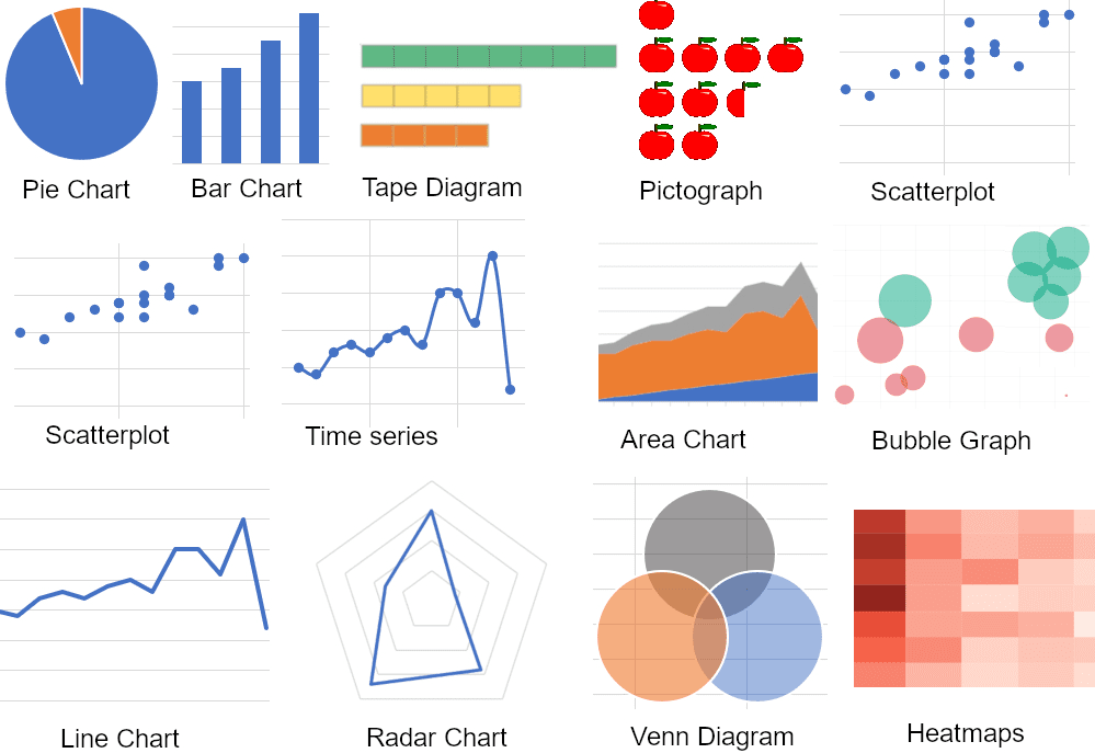
Image from polymersearch

Relevancy is crucial for efficient data visualizations, therefore, it is advised to use the correct charts and graphs to display any data. For example, a line chart is the recommended way to display trends, and scatter charts show relationships and correlations, while a pie or donut chart can show percentages.

4. Create a Story

Data visualization should be more than just cold, hard numbers, it should have a clear story that keeps the audience engaged and gradually reaches a conclusion. Make sure you include any relevant background information before delving into the figures and highlight the key points to ensure they’re understood.

5. Test Your Data Visualization

The last step is to test the data visualization so it can be optimized before presenting it to an audience. Make sure the key points are apparent, the data is accurate, and that charts and graphs are easy to follow. Having the visualization cross-checked by a colleague is one of the best ways to find any errors, typos, or inconsistencies, plus they can also give honest feedback on whether the design and content are engaging.

Summary: Presenting Complex Information Effectively

Data visualization has become essential in terms of presenting big data and discovering new insights and trends, especially in the sales and marketing sectors. By presenting data in this way, audiences are engaged, and complex information can be displayed in a way that is easy to digest.

This can result in a better understanding of big data and analytics across an organization, resulting in improved decision-making and boosting operations.
Nahla Davies is a software developer and tech writer. Before devoting her work full time to technical writing, she managed — among other intriguing things — to serve as a lead programmer at an Inc. 5,000 experiential branding organization whose clients include Samsung, Time Warner, Netflix, and Sony.

More On This Topic

  • Data Analytics: The Four Approaches to Analyzing Data and How To Use Them…
  • How to Effectively Use Pandas GroupBy
  • The secret to analysing large, complex datasets quickly and productively?
  • Solving 5 Complex SQL Problems: Tricky Queries Explained
  • Python String Matching Without Complex RegEx Syntax
  • HuggingGPT: The Secret Weapon to Solve Complex AI Tasks

Spotify spotted prepping a $19.99/mo ‘Superpremium’ service with lossless audio, AI playlists and more

Spotify spotted prepping a $19.99/mo ‘Superpremium’ service with lossless audio, AI playlists and more Sarah Perez @sarahintampa / 8 hours

It looks like Spotify’s rumored “Superpremium” offering is gearing up for a launch. According to references discovered in the Spotify app’s code by Chris Messina, the Superpremium service now has a flashy logo and a longer list of features beyond the 24-bit lossless audio we’ve been anticipating. In fact, the broader feature set appears to be set to include the recently discovered AI playlist generation tools, advanced mixing tools, additional hours of audiobook listening, and a personalized offering called “Your Sound Capsule.”

Messina had also uncovered Spotify’s development of AI playlists earlier this week, which would allow users to create unique playlists using prompts. Spotify declined to confirm the development at the time, noting it wouldn’t comment on possible new features.

Image Credits: Chris Messina on Threads (opens in a new window)

However, the references to the Superpremium brand have been found in the code before today.

A couple of weeks ago, Reddit user Hypixely noted that the new, more expensive tier would be priced at $19.99 per month, citing screenshots of Spotify’s code, and would include AI playlists and lossless audio. The latter is no longer referenced as “HiFi,” the premium service Spotify introduced years ago but then failed to launch.

Questioned on the delay in Spotify’s Q2 earnings, CEO Daniel Ek said, “What I will say of course, is that Hi-Fi remains something that we think has value, but it’s something that has value to probably and more aficionados in the streaming market and we’re interested in, obviously, how we could use that as one tool to, in the future, increase our value even further, but we don’t have anything to announce at this point.” Reading between the lines, it sounds like he could be suggesting using HiFi as one way to raise prices in the future, but that the service had been retooled to reach a broader audience.

In addition to the lossless audio and other findings, the Redditor had noted Superpremium users would be able to filter their library by mood, activity, or genre, which Messina also confirms, adding that options like vibe and beats per minute were other filtering options now appearing. Plus, Superpremium includes 20-30 hours of audiobook listening, Messina says — a bit higher than the recently announced 15 free hours that now ship with the Premium subscription.

Meanwhile, the Reddit user had also uncovered a Superpremium feature called Soundcheck that tells you about your listening habits and lets you discover what mix of sounds is “uniquely yours.” However, Messina is seeing this feature now labeled as “Your Sound Capsule.” He suspects could be related to Spotify’s “playlist in a bottle” — a musical time capsule experience launched earlier this year. Plus, Messina found references to something called Highlights, which appears to be Last.fm-like listening stats.

Reached for comment, Spotify declined to share anything more on the new findings.

“At Spotify, we are constantly iterating and ideating to improve our product offering and offer value to users. But we don’t comment on speculation around possible new features and do not have anything new to share at this time,” a spokesperson told TechCrunch.

Sarah Perez can be reached at sarahp@techcrunch.com or (415) 234-3994 on Signal.

3 Data Science Projects Guaranteed to Land You That Job

3 Data Science Projects Guaranteed to Land You That Job
Image by Author

Quite a bold statement! Claiming I can guarantee someone you’ll land a job, that is.

OK, the truth is, nothing in life is guaranteed, especially finding a job. Not even in data science. But what will get you veeeery, very close to the guarantee is having data projects in your portfolio.

Why do I think projects are so decisive? Because, if chosen wisely, they most effectively showcase the range and depth of your technical data science skills. The quality of projects counts, not their number. They should cover as many as possible data science skills.

So, which projects guarantee you that on the lowest number of projects? If limited to doing only three projects, I would select these.

  1. Insights from City Supply and Demand Data
  2. Customer Churn Prediction
  3. Predictive Policing

But don’t take it too literally. The message here is not that you should stick strictly to those three. I selected them because they cover most of the technical skills required in data science. If you want to do some other data science projects, feel free to do so. But if you’re limited with time/number of projects, choose them wisely and select those that will test the widest array of data science skills.

Speaking of which, let’s make clear what they are.

Technical Skills to Look for in Data Science Projects

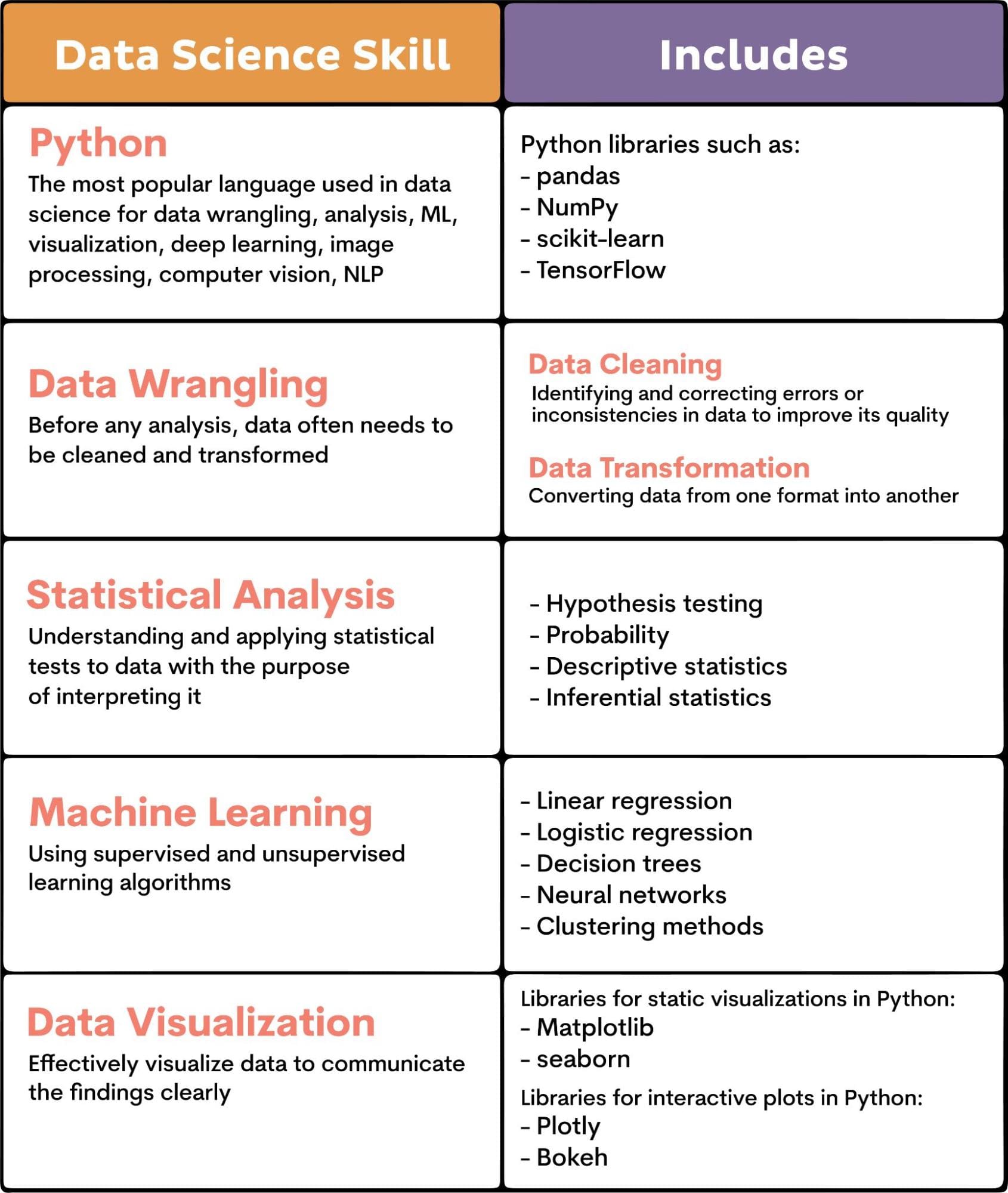
There are five fundamental skills in data science.

  • Python
  • Data Wrangling
  • Statistical Analysis
  • Machine Learning
  • Data Visualization

This is a checklist you should consider when trying to get the maximum from the data science projects you choose.

Here’s an overview of what these skills encompass.

3 Data Science Projects Guaranteed to Land You That Job

Of course, there’s much more to data science skills. They also include knowing SQL and R, big data technologies, deep learning, natural language processing, and cloud computing.

However, the need for them heavily depends on the job description. But the fundamental five skills I mentioned, you can’t do without.

Let’s now take a look at how the three data science projects I chose challenge these skills.

3 Data Science Projects to Practice Fundamental Data Science Skills

Some of these projects might be a little too advanced for some. In that case, give these 19 data science projects for beginners a try.

1. Understanding City Supply and Demand: Business Analysis

Source: Insights from City Supply and Demand Data

Topic: Business Analysis

Brief Overview: Cities are hubs of demand and supply interactions for Uber. Analyzing these can offer insights into the company’s business and planning. Uber gives you a dataset with details about trips. You need to answer eleven questions to give a business insight on trips, their time, demand for drivers, etc.

Project Execution: You’re given eleven questions which have to be answered in the displayed order. Answering them will involve tasks such as

  • Filling in the missing values,
  • Aggregating data,
  • Finding the largest values,
  • Parsing time interval,
  • Calculating percentages,
  • Calculating weighted averages,
  • Finding differences,
  • Visualizing data, and so on.

Skills Showcased: Exploratory data analysis (EDA) for selecting needed columns and filling in the missing values, deriving actionable insights about completed trips (different periods, weighted average ratio of trips per driver, finding the busiest hours to help draft a driver schedule, the relationship between supply and demand, etc.), visualizing the relationship between supply and demand.

2. Customer Churn Prediction: A Classification Task

Source: Customer Churn Prediction

Topic: Supervised learning (classification)

Brief Overview: In this data science project, Sony Research gives you a dataset of a telecom company’s customers. They expect you to perform exploratory analysis and extract insights. Then you’ll have to build a churn prediction model, evaluate it and discuss the issues when deploying the model into production.

Project Execution: The project should be approached in these major phases.

  • Exploratory Analysis and Extracting Insights
    • Check data fundamentals (nulls, uniqueness)
    • Choose data you need and form your dataset
    • Visualize data to check the distribution of the values
    • Form a correlation matrix
    • Check the feature importances
  • Train/Test Split
    • Use sklearn to split the dataset into training and testing using the 80%-20% ratio
  • Predictive Model
    • Apply classifiers and pick one to use in production based on the performance
  • Metrics
    • Use accuracy and F1 score while comparing the performance of different algorithms
  • Model Results
    • Use classical ML models
    • Visualize the Decision Tree and see how tree-based algorithms perform
  • Deep Learning Model
    • Try Artificial Neural Network (ANN) on this problem
  • Deployment issues
    • Monitor the model performance to avoid data drift and concept drift

Skills Showcased: Exploratory data analysis (EDA) and data wrangling to check for nulls, data uniqueness, deriving insights about the distribution of data, and positive and negative correlations; data visualization in histograms and correlation matrix; applying ML classifiers using the sklearn library, measuring algorithms accuracy and F1 score, comparing the algorithms, visualizing decision tree; using Artificial Neural Network to see how deep learning performs; model deploying where you need to be aware of data drifting and concept drifting problems in the MLOps cycle.

3. Predictive Policing: Examining the Implications

Source: The Perils of Predictive Policing

Topic: Supervised learning (regression)

Brief Overview: This predictive policing utilizes algorithms and data analytics to predict where crimes are likely to happen. Your chosen approach can have profound ethical and societal implications. It uses the 2016 City of San Francisco crime data from its open data initiative. The project will attempt to predict the number of crime incidents in a given zip code on a certain day of the week and time of day.

Project Execution: Here are the main steps the project author has undertaken.

  • Selecting the variables and calculating the total number of crimes per year per zip code per hour
  • Train/test split data chronologically
  • Trying five regression algorithms:
    • Linear regression
    • Random Forest
    • K-Nearest Neighbors
    • XGBoost
    • Multilayer Perceptron

Skills Showcased: Exploratory data analysis (EDA) and data wrangling where you end up with the data about crimes, hour, day of the week, and zip code; ML (supervised learning/regression) where you try how linear regression, random forest regressor, K-nearest neighbor, XGBoost are performing; deep learning where you use multilayer perceptron to try to explain the results you get; deriving insights on the crime prediction and its possibility to be misused; deploying model into an interactive map.

If you want to do more projects using similar skills, here are 30+ ML project ideas.

Conclusion

By completing these data science projects, you will test and acquire essential data science skills, such as data wrangling, data visualization, statistical analysis, building and deploying ML models.

Speaking of ML, I focused here on supervised learning as this is more commonly used in data science. I can almost guarantee you that these data science projects will be enough to land you a desired job.

But you should read the job description carefully. If you see that it requires unsupervised learning, NLP, or something else I didn’t cover here, include such a project or two in your portfolio.

No matter what, you’re still not stuck with only three projects. They are here to guide you on how to choose your projects that will guarantee you landing a job. Be mindful of the projects’ complexity, as they should cover fundamental data science skills extensively.

Now, off you go and land that job!
Nate Rosidi is a data scientist and in product strategy. He's also an adjunct professor teaching analytics, and is the founder of StrataScratch, a platform helping data scientists prepare for their interviews with real interview questions from top companies. Connect with him on Twitter: StrataScratch or LinkedIn.

More On This Topic

  • Data Science Projects That Will Land You The Job in 2022
  • KDnuggets News, June 1: The Complete Collection of Data Science Books;…
  • A Data Science Portfolio That Will Land You The Job
  • A Data Science Portfolio That Will Land You The Job in 2022
  • Unable to Land a Data Science Job? Here’s Why
  • KDnuggets™ News 22:n05, Feb 2: 7 Steps to Mastering Machine Learning…

As generative AI models evolve, customized test benchmarks and openness are crucial

Models for spheres in different colors

As generative artificial intelligence (AI) models continue to evolve, industry collaboration and customized test benchmarks will be crucial amid organizations' efforts to establish the right fit for their business.

This effort will be necessary as enterprises seek out large language models (LLMs) trained on data specific to their verticals, and as countries look to ensure AI models are trained on data as well as principles that are based on their own unique values, according to Ong Cheng Hui, assistant chief executive of the business and technology group at Infocomm Media Development Authority (IMDA).

Also: 40% of workers will have to reskill in the next three years due to AI, says IBM study

She questioned whether one large foundation model is really the way forward or whether there is a need for more specialized models, pointing to Bloomberg's efforts to build its own large-scale generative AI model, BloombergGPT, that has been specifically trained on financial data.

As long as the necessary expertise, data, and compute resources "are not locked up", the industry can continue to drive developments forward, said Ong, who was speaking to media on the sidelines of the Red Hat Summit this week.

The software vendor is a member of Singapore's AI Verify Foundation, which aims to tap the open-source community to develop test toolkits to guide the responsible and ethical use of AI. Launched in June with six other premier members apart from Red Hat, including Google and Microsoft, the initiative is led by IMDA and currently has more than 60 general members.

Also: The best AI chatbots right now

Singapore has the highest adoption of open-source technologies and principles in the Asia-Pacific region, according to Guna Chellappan, Red Hat's Singapore general manager. Citing findings from research the vendor commissioned, Chellappan noted that 72% of Singapore organizations said they have made "high or very high progress" in their adoption of open source.

Port operator PSA Singapore and UOB are among Red Hat's local customers, with the former deploying open-source applications to automate its operations. Local bank UOB taps Red Hat OpenShift to support its cloud development.

Going the open-source route is key because transparency is important to driving the message around AI ethics, Ong said, noting that it would be ironic to ask the public to trust the foundation's test toolkits if details on them were not freely available.

She also took inspiration from other fields, in particular, cybersecurity, where tools are often developed in an open-source environment and where the community continuously contributes updates to improve these applications.

"We want AI Verify to be the same," she said, adding that if the foundation developed the toolkits in silos, it would not be able to keep up with the industry's fast-changing developments.

Also: How this simple ChatGPT prompt tweak can help refine your AI-generated content

This open collaboration will also help navigate efforts toward the best and most effective solutions, she noted. The automotive industry went through a similar cycle where seatbelts were designed, tested, and redesigned, so the one that could best protect drivers could be determined.

The same approach now needs to happen with generative AI, where models and applications should be continuously tested and tweaked to ensure they can be safely deployed within the organization's guardrails.

As it is, though, decisions by major players such as OpenAI not to disclose technical details behind their LLMs are worrying some sections of the industry.

A team of academics led by University of Oxford's Emanuele La Malfa last month published a research paper highlighting issues that could surface from the lack of information about large language AI models in four areas: accessibility, replicability, reliability, and trustworthiness (AART).

The scholars note that "commercial pressure" has pushed market players to make their AI models accessible as a service to customers, typically via an API. However, information on the models' architecture, implementation, training data, or training processes is neither provided nor made available to be inspected.

Also: How to use ChatGPT to make charts and tables

These access restrictions, along with how LLMs are often black box in nature, contravene the public's and research community's need to understand, trust, and control these models better, La Malfa's team wrote. "This causes a significant problem at the field's core: the most potent and risky models are also the most difficult to analyze," they noted.

OpenAI previously defended its decision not to provide details of its GPT-4 iteration, pointing to the competitive landscape and the security implications of releasing such information on large-scale models, including their architecture, training method, and dataset construction.

Asked how organizations should go about adopting generative AI, Ong said two camps will emerge in the foundation model layer, with one camp comprising a handful of proprietary large language AI models, including OpenAI's ChatGPT-4, and the other camp opting to build their models on an open-source architecture, such as Meta's Llama-v2.

Businesses that are concerned about transparency can choose the open-source alternatives, she suggested.

Customized test benchmarks are needed

At the same time, though, businesses increasingly will build on top of the foundation layer in order to deploy generative AI applications that better meet their domain-specific requirements, such as education and financial services.

Also: One in four workers fears being considered 'lazy' if they use AI tools

This application layer will also need to have the guardrails and, hence, some level of transparency and trust will need to be established here, Ong said.

Here is where AI Verify, with its test toolkits, hopes to help steer companies in the right direction. With organizations operating in different markets, regions, and industries, their primary concern will not be whether an AI model is open source, but whether their generative AI applications fulfil their AI ethics and safety principles, she explained.

Ong noted that many businesses, as well as governments, are currently testing and assessing generative AI tools, for both consumer-facing and non-consumer-facing use cases. Often they start with the latter to minimize potential risks and customer impact, and expand their test pilots to include consumer-facing applications when they have reached a certain comfort level.

Organizations in highly regulated sectors, such as financial services, will exercise even more caution with consumer-facing applications, she added.

Countries and societies also hold different values and cultures. Governments will want to ensure AI models are built on training data and principles that are based on their population's unique mix.

Also: Why generative AI so popular: Everything you need to know

Singapore's demographic, for instance, is multi-racial, multi-religion, and multi-lingual. Racial harmony is unique to its society as are local structures and policies, such as its national social security savings scheme, Ong said.

Noting that the LLMs that are widely used today do not perform uniformly well when tested against cultural questions, she pondered with this deficiency suggested a need for Singapore to build its own LLM and, if so, whether it has sufficient data — as a country with a small population — to train the AI model.

With market players in other regions, specifically China, also releasing their own LLMs trained on local data, ZDNET asked if there was a way to fuse or integrate foundation models from different regions, so they are better adapted to Singapore's population mix.

Ong believes there may be a possibility for different LLMs to learn from each other, which is a potential application that can be explored in the research field. Efforts here will have to ensure data privacy and sensitive data remain protected, she said.

Singapore is currently evaluating the feasibility of such options, including the potential of building its own LLM, according to Ong.

Also: The AI boom will amplify social problems if we don't act now, says AI ethicist

Requirements for specialized generative AI models will further drive the importance of customized toolkits and benchmarks against which AI models are tested and assessed, she said.

These bechmarks will be needed to test generative AI applications, including third-party and vertical-specific tools, against an organization's or country's AI principles and to ensure their deployment remains responsible and ethical.

Artificial Intelligence

Sai Life Sciences Partners with Dassault Systèmes to Advance Drug Discovery 

Sai Life Sciences, one of India’s leading contract research, development, and manufacturing organisations, aims to accelerate drug discovery by partnering with Dassault Systemes, a leader in product lifecycle management (PLM) solutions and others.

In a recent announcement, Dassault Systèmes revealed that Sai Life Sciences has chosen their technology to enhance data quality, and foster collaboration within the organisation’s Research and Process Development laboratories. This move is expected to reshape the landscape of pharmaceutical research and development.

Sai Life Sciences is harnessing the power of Dassault Systemes’ industry solution experience, named “ONE Lab,” which operates on the innovative 3DEXPERIENCE platform. This solution leverages BIOVIA applications for seamless data accessibility and analysis.

The organisation seeks to create an integrated digital platform that seamlessly connects its R&D and chemistry, manufacturing, and controls (CMC) laboratories. This initiative aims to address some of the most pressing challenges faced by the pharmaceutical research sector, particularly those related to project implementation.

Sai Life Sciences aims to reduce errors, save time, promote sustainability practices, and establish a unified, reliable source of information that fosters collaboration among multiple stakeholders, spanning research, development, and commercial manufacturing.

Dr. Damodharen, chief quality officer at Sai Life Sciences, echoed this sentiment, stating, “The integration of Dassault Systemes’ ‘ONE Lab’ empowers us to drive productivity, enhance data quality, and fortify data security, revolutionising our approach to research across the entire spectrum from early-stage development to commercial manufacturing.”

The implementation of “ONE Lab” has played a role in empowering Sai Life Sciences to construct an all-encompassing digital platform for its R&D and CMC laboratories.

Overcoming common project implementation challenges, particularly in the realm of change management, has been a remarkable achievement in this endeavour. “ONE Lab” offers various benefits to the industry, including laboratory optimization and knowledge utilisation for accelerated time-to-market.

The post Sai Life Sciences Partners with Dassault Systèmes to Advance Drug Discovery appeared first on Analytics India Magazine.

Former Google and Meta Engineers Announce AI Startup

Six months ago, a software engineer named David Petrou left Google after 17 years to start his AI company. After months of silence, the former Googler has revealed some exciting updates regarding the startup named Continua.

Petrou, a founding member of projects like Google Goggles and Google Glass, has a track record of leading large teams pioneering on-device machine intelligence. Now, he finds himself among a select group of individuals, including former colleagues and industry experts.

The lineup of Petrou’s team includes Jonathan Betz, formerly of Meta, JT DiMartile, who held a senior staff motion designer position, as well as names like George Nachman, Jason Bacasa, Noah Lieberman (with experience at WhatsApp, Google, and AOL), Daniel Switkin (a former Google Staff Software Engineer and the visionary behind the first version of Oculus Avatar Editor), Ken Bowden (formerly of Slack), and Jason Hunter (with previous stints at Google and Microsoft).

While the specifics of the startup’s financial backing remain undisclosed, Petrou confirmed that they have received investments from prominent investors and angel backers. The company has also recently established a presence in San Francisco’s Financial District.

Without revealing much about the product under process, the company’s website provides a glimpse into the work in progress, describing it as “a mission to revolutionize how people interact with information, services, and each other by applying always-on, deeply integrated language models.”

The team is currently looking for software engineers skilled in a wide range of areas, spanning machine learning, systems/infrastructure, iOS, Android, and web frontend development, as indicated on their career page.

In closing, Petrou shared his vision, stating, “Together, we’ll bring our vision of personal agents endowed with LLMs (large language models) to the world. It will be hard work, there are open-ended problems to solve, but it will be an adventure.”

The post Former Google and Meta Engineers Announce AI Startup appeared first on Analytics India Magazine.

Unveiling Hidden Patterns: An Introduction to Hierarchical Clustering

Unveiling Hidden Patterns: An Introduction to Hierarchical Clustering
Image by Author

When you’re familiarizing yourself with the unsupervised learning paradigm, you'll learn about clustering algorithms.

The goal of clustering is often to understand patterns in the given unlabeled dataset. Or it can be to find groups in the dataset—and label them—so that we can perform supervised learning on the now-labeled dataset. This article will cover the basics of hierarchical clustering.

What Is Hierarchical Clustering?

Hierarchical clustering algorithm aims at finding similarity between instances—quantified by a distance metric—to group them into segments called clusters.

The goal of the algorithm is to find clusters such that data points in a cluster are more similar to each other than they are to data points in other clusters.

There are two common hierarchical clustering algorithms, each with its own approach:

  • Agglomerative Clustering
  • Divisive Clustering

Agglomerative Clustering

Suppose there are n distinct data points in the dataset. Agglomerative clustering works as follows:

  1. Start with n clusters; each data point is a cluster in itself.
  2. Group data points together based on similarity between them. Meaning similar clusters are merged depending on the distance.
  3. Repeat step 2 until there is only one cluster.

Divisive Clustering

As the name suggests, divisive clustering tries to perform the inverse of agglomerative clustering:

  1. All the n data points are in a single cluster.
  2. Divide this single large cluster into smaller groups. Note that the grouping together of data points in agglomerative clustering is based on similarity. But splitting them into different clusters is based on dissimilarity; data points in different clusters are dissimilar to each other.
  3. Repeat until each data point is a cluster in itself.

Distance Metrics

As mentioned, the similarity between data points is quantified using distance. Commonly used distance metrics include the Euclidean and Manhattan distance.

For any two data points in the n-dimensional feature space, the Euclidean distance between them given by:

Unveiling Hidden Patterns: An Introduction to Hierarchical Clustering

Another commonly used distance metric is the Manhattan distance given by:

Unveiling Hidden Patterns: An Introduction to Hierarchical Clustering

The Minkowski distance is a generalization—for a general p >= 1—of these distance metrics in an n-dimensional space:

Unveiling Hidden Patterns: An Introduction to Hierarchical Clustering Distance Between Clusters: Understanding Linkage Criteria

Using the distance metrics, we can compute the distance between any two data points in the dataset. But you also need to define a distance to determine “how” to group together clusters at each step.

Recall that at each step in agglomerative clustering, we pick the two closest groups to merge. This is captured by the linkage criterion. And the commonly used linkage criteria include:

  • Single linkage
  • Complete linkage
  • Average linkage
  • Ward’s linkage

Single Linkage

In single linkage or single-link clustering, the distance between two groups/clusters is taken as the smallest distance between all pairs of data points in the two clusters.

Unveiling Hidden Patterns: An Introduction to Hierarchical Clustering

Complete Linkage

In complete linkage or complete-link clustering, the distance between two clusters is chosen as the largest distance between all pairs of points in the two clusters.

Unveiling Hidden Patterns: An Introduction to Hierarchical Clustering

Average Linkage

Sometimes average linkage is used which uses the average of the distances between all pairs of data points in the two clusters.

Ward’s Linkage

Ward's linkage aims to minimize the variance within the merged clusters: merging clusters should minimize the overall increase in variance after merging. This leads to more compact and well-separated clusters.

The distance between two clusters is calculated by considering the increase in the total sum of squared deviations (variance) from the mean of the merged cluster. The idea is to measure how much the variance of the merged cluster increases compared to the variance of the individual clusters before merging.

When we code hierarchical clustering in Python, we’ll use Ward’s linkage, too.

What Is a Dendrogram?

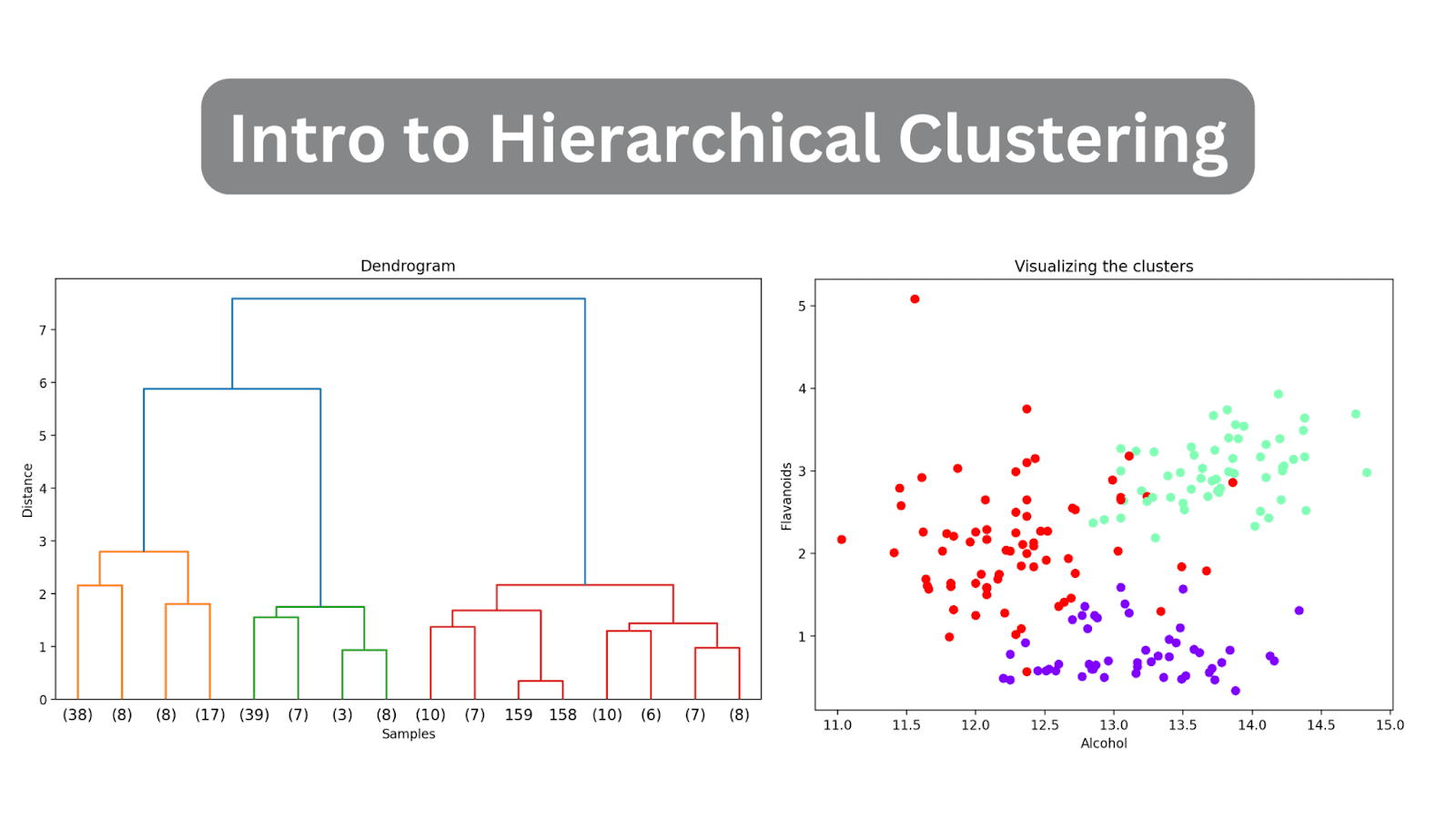
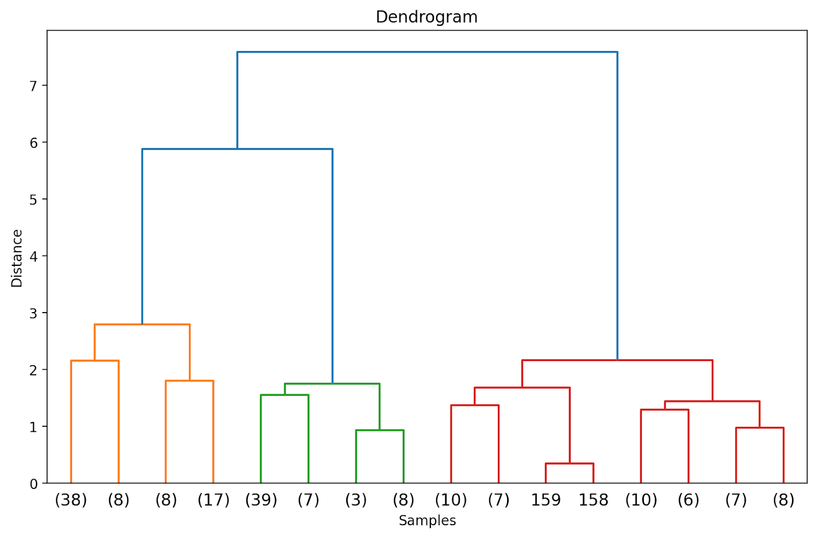
We can visualize the result of clustering as a dendrogram. It is a hierarchical tree structure that helps us understand how the data points—and subsequently clusters—are grouped or merged together as the algorithm proceeds.

In the hierarchical tree structure, the leaves denote the instances or the data points in the data set. The corresponding distances at which the merging or grouping occurs can be inferred from the y-axis.
Unveiling Hidden Patterns: An Introduction to Hierarchical Clustering
Sample Dendrogram | Image by Author

Because the type of linkage determines how the data points are grouped together, different linkage criteria yield different dendrograms.

Based on the distance, we can use the dendrogram—cut or slice it at a specific point—to get the required number of clusters.

Unlike some clustering algorithms like K-Means clustering, hierarchical clustering does not require you to specify the number of clusters beforehand. However, agglomerative clustering can be computationally very expensive when working with large datasets.

Hierarchical Clustering in Python with SciPy

Next, we’ll perform hierarchical clustering on the built-in wine dataset—one step at a time. To do so, we’ll leverage the clustering package—scipy.cluster—from SciPy.

Step 1 – Import Necessary Libraries

First, let's import the libraries and the necessary modules from the libraries scikit-learn and SciPy:

# imports  import pandas as pd  import matplotlib.pyplot as plt  from sklearn.datasets import load_wine  from sklearn.preprocessing import MinMaxScaler  from scipy.cluster.hierarchy import dendrogram, linkage

Step 2 – Load and Preprocess the Dataset

Next, we load the wine dataset into a pandas dataframe. It is a simple dataset that is part of scikit-learn’s datasets and is helpful in exploring hierarchical clustering.

# Load the dataset  data = load_wine()  X = data.data    # Convert to DataFrame  wine_df = pd.DataFrame(X, columns=data.feature_names)

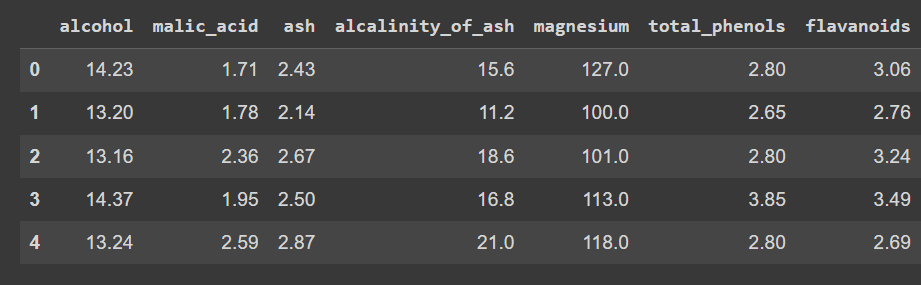
Let’s check the first few rows of the dataframe:

wine_df.head()
Unveiling Hidden Patterns: An Introduction to Hierarchical Clustering
Truncated output of wine_df.head()

Notice that we’ve loaded only the features—and not the output label—so that we can peform clustering to discover groups in the dataset.

Let's check the shape of the dataframe:

print(wine_df.shape)

There are 178 records and 14 features:

Output >>> (178, 14)

Because the data set contains numeric values that are spread across different ranges, let's preprocess the dataset. We’ll use MinMaxScaler to transform each of the features to take on values in the range [0, 1].

# Scale the features using MinMaxScaler  scaler = MinMaxScaler()  X_scaled = scaler.fit_transform(X)

Step 3 – Perform Hierarchical Clustering and Plot the Dendrogram

Let’s compute the linkage matrix, perform clustering, and plot the dendrogram. We can use linkage from the hierarchy module to calculate the linkage matrix based on Ward’s linkage (set method to 'ward').

As discussed, Ward’s linkage minimizes the variance within each cluster. We then plot the dendrogram to visualize the hierarchical clustering process.

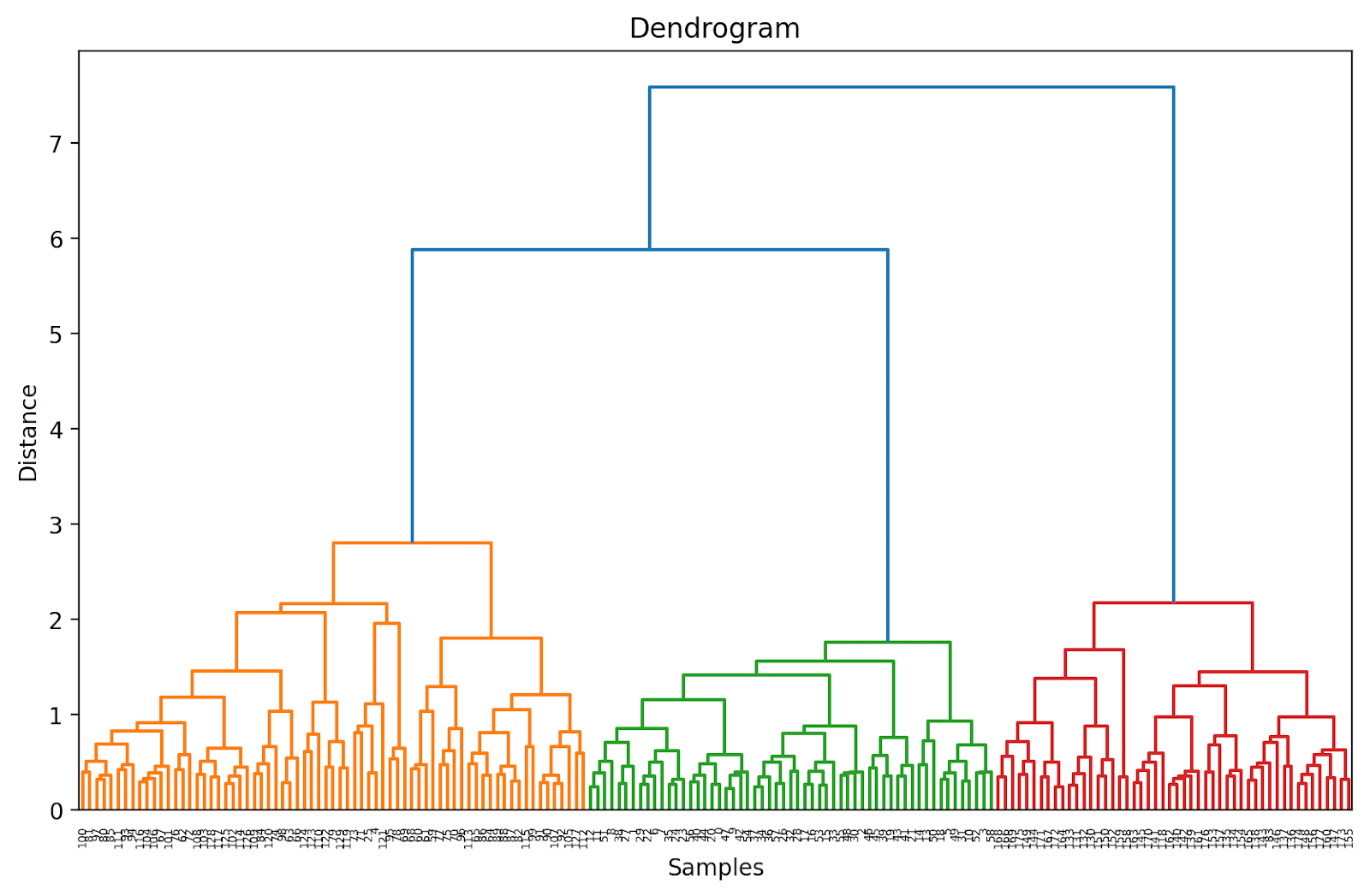
# Calculate linkage matrix  linked = linkage(X_scaled, method='ward')    # Plot dendrogram  plt.figure(figsize=(10, 6),dpi=200)  dendrogram(linked, orientation='top', distance_sort='descending', show_leaf_counts=True)  plt.title('Dendrogram')  plt.xlabel('Samples')  plt.ylabel('Distance')  plt.show()

Because we haven't (yet) truncated the dendrogram, we get to visualize how each of the 178 data points are grouped together into a single cluster. Though this is seemingly difficult to interpret, we can still see that there are three different clusters.
Unveiling Hidden Patterns: An Introduction to Hierarchical Clustering

Truncating the Dendrogram for Easier Visualization

In practice, instead of the entire dendrogram, we can visualize a truncated version that's easier to interpret and understand.

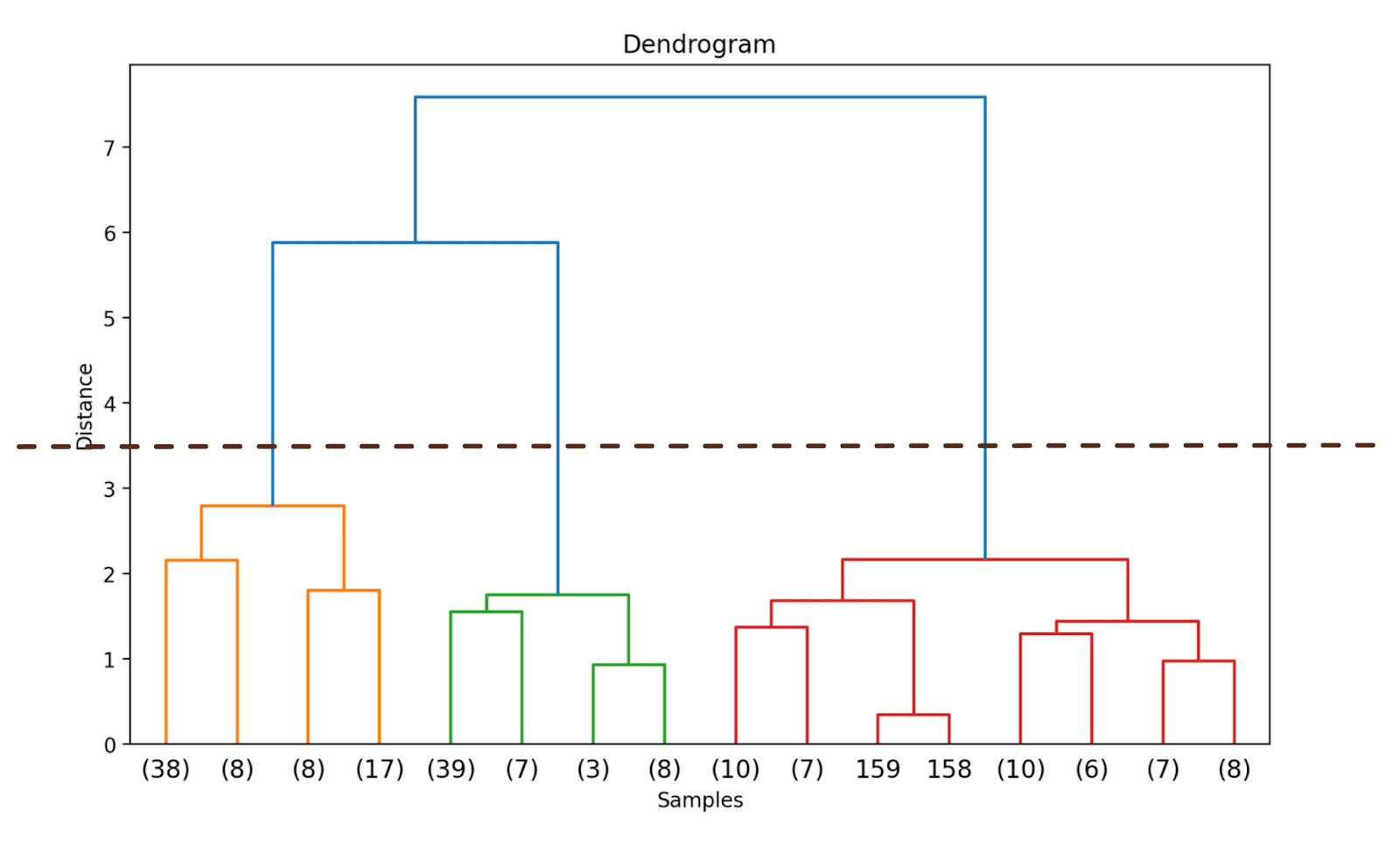
To truncate the dendrogram, we can set truncate_mode to 'level' and p = 3.

# Calculate linkage matrix  linked = linkage(X_scaled, method='ward')    # Plot dendrogram  plt.figure(figsize=(10, 6),dpi=200)  dendrogram(linked, orientation='top', distance_sort='descending', truncate_mode='level', p=3, show_leaf_counts=True)  plt.title('Dendrogram')  plt.xlabel('Samples')  plt.ylabel('Distance')  plt.show()

Doing so will truncate the dendrogram to include only those clusters which are within 3 levels from the final merge.

Unveiling Hidden Patterns: An Introduction to Hierarchical Clustering

In the above dendrogram, you can see that some data points such as 158 and 159 are represented individually. Whereas some others are mentioned within parentheses; these are not individual data points but the number of data points in a cluster. (k) denotes a cluster with k samples.

Step 4 – Identify the Optimal Number of Clusters

The dendrogram helps us choose the optimal number of clusters.

We can observe where the distance along the y-axis increases drastically, choose to truncate the dendrogram at that point—and use the distance as the threshold to form clusters.

For this example, the optimal number of clusters is 3.
Unveiling Hidden Patterns: An Introduction to Hierarchical Clustering

Step 5 – Form the Clusters

Once we have decided on the optimal number of clusters, we can use the corresponding distance along the y-axis—a threshold distance. This ensures that above the threshold distance, the clusters are no longer merged. We choose a threshold_distance of 3.5 (as inferred from the dendrogram).

We then use fcluster with criterion set to 'distance' to get the cluster assignment for all the data points:

from scipy.cluster.hierarchy import fcluster    # Choose a threshold distance based on the dendrogram  threshold_distance = 3.5      # Cut the dendrogram to get cluster labels  cluster_labels = fcluster(linked, threshold_distance, criterion='distance')    # Assign cluster labels to the DataFrame  wine_df['cluster'] = cluster_labels

You should now be able to see the cluster labels (one of {1, 2, 3}) for all the data points:

print(wine_df['cluster'])
Output >>>  0      2  1      2  2      2  3      2  4      3        ..  173    1  174    1  175    1  176    1  177    1  Name: cluster, Length: 178, dtype: int32

Step 6 – Visualize the Clusters

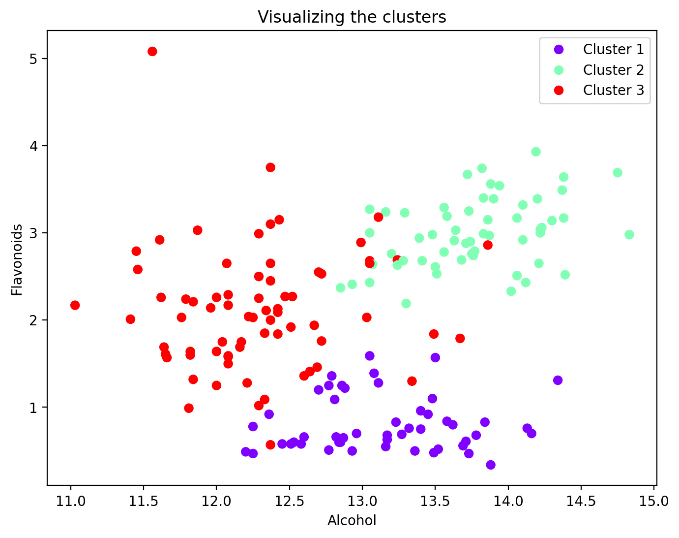
Now that each data point has been assigned to a cluster, you can visualize a subset of features and their cluster assignments. Here's the scatter plot of two such features along with their cluster mapping:

plt.figure(figsize=(8, 6))    scatter = plt.scatter(wine_df['alcohol'], wine_df['flavanoids'], c=wine_df['cluster'], cmap='rainbow')  plt.xlabel('Alcohol')  plt.ylabel('Flavonoids')  plt.title('Visualizing the clusters')    # Add legend  legend_labels = [f'Cluster {i + 1}' for i in range(n_clusters)]  plt.legend(handles=scatter.legend_elements()[0], labels=legend_labels)    plt.show()
Unveiling Hidden Patterns: An Introduction to Hierarchical Clustering Wrapping Up

And that's a wrap! In this tutorial, we used SciPy to perform hierarchical clustering just so we can cover the steps involved in greater detail. Alternatively, you can also use the AgglomerativeClustering class from scikit-learn’s cluster module. Happy coding clustering!

References

[1] Introduction to Machine Learning

[2] An Introduction to Statistical Learning (ISLR)
Bala Priya C is a developer and technical writer from India. She likes working at the intersection of math, programming, data science, and content creation. Her areas of interest and expertise include DevOps, data science, and natural language processing. She enjoys reading, writing, coding, and coffee! Currently, she's working on learning and sharing her knowledge with the developer community by authoring tutorials, how-to guides, opinion pieces, and more.

More On This Topic

  • Clustering Unleashed: Understanding K-Means Clustering
  • Introduction to Clustering in Python with PyCaret
  • Unveiling the Potential of CTGAN: Harnessing Generative AI for Synthetic…
  • Unveiling Midjourney 5.2: A Leap Forward in AI Image Generation
  • Unveiling Unsupervised Learning
  • Unveiling Neural Magic: A Dive into Activation Functions

Google Home will get a generative AI boost, too

Made by Google Sign Logo

Google superpowered Assistant in the Pixel 8 and Pixel 8 Pro this week, but the slew of generative artificial intelligence (AI) updates coming to the Google Home app is sure to be a head-turner for smart home enthusiasts.

The Google Home app will now have generative AI built-in to let users ask questions like, "Did any strangers come to my door yesterday?", and they can have the Home app respond in natural language like a personal security guard.

Also: 4 AI-powered photo and video features on Pixel 8 and Pixel 8 Pro giving us Google envy

Rather than a security guard, however, the feature will resemble a personal assistant, as Assistant with Bard will likely power it. This change is Google's latest update to its virtual assistant, which gives it the generative AI of the AI chatbot, Bard, powered by Google's large language model, PaLM 2.

Google is also featuring a new summary of users' smart home activity. This summary will let users quickly glance at their recent history and ask Google Home questions about it, like how many packages they received or how many people were detected.

A new "Help me script" feature is another way that generative AI is coming to Google Home. This feature joins Script Editor, which is now in its preview phase, and allows users to write and edit code to create more custom automations.

Also: Google Assistant is finally getting the AI upgrades it deserves. Here's what's new

"Help me script" will use generative AI to create code, much like ChatGPT and Bard can. Describing what you want the code to do in natural language will get "Help me script" to generate the code you need to enter into Script Editor.

The ability to code to create specific automations that are unavailable by default in the Google Home app helps users make routines like, "When the doorbell rings, flash the lights in the office and make an announcement over the speakers."

Google

Optimised Electrotech Partners with ISRO for Technology Transfer

ISRO

Optimized Electrotech Pvt Ltd (OEPL), an imaging surveillance technology has announced the technology transfer of the Optical Imaging System (OIS) from NewSpace India Limited (NSIL), a subsidiary of the Indian Space Research Organisation (ISRO). The OIS enables long-distance surveillance across the visible and near-infrared spectra of the electromagnetic spectrum.

The system operates under various lighting conditions, including twilight and mid-day, through a single sensor and a consistent setup. This advancement holds potential, particularly in challenging environments such as coastal and desert regions, as well as in applications where precision surveillance is much needed.

The transfer has been facilitated through a comprehensive Technology Transfer Agreement, paving the way for the advancement, production, and commercialization of the Optical Imaging System both within India and on a global scale.

This initiative has received support from the Prime Minister’s Office (PMO), highlighting the collaboration’s significance. Furthermore, ISRO’s expertise and innovation in space technology will complement Optimized Electrotech’s state-of-the-art imaging capabilities, creating a synergy poised to revolutionise surveillance.

Sandeep Shah, Co-Founder and Managing Director at Optimized Electrotech, expressed his enthusiasm, stating, “With the surveillance systems market in India projected to reach $2.5 billion, with annual growth rates of 25-30%, this collaboration is a game-changer. OIS holds the promise of revolutionising security and surveillance in demanding environments, aligning perfectly with current market demands.

The agreement, which was formalised in September, comes as a result of the collaborative efforts of key stakeholders, including Dr. Pawan Kr Goenka, Chairperson of Inspace, Rajeev Jyoti, Director of Inspace, and A. Arunachalam, Director of NSIL.

The post Optimised Electrotech Partners with ISRO for Technology Transfer appeared first on Analytics India Magazine.