Image by Author
Analyzing a dataset to understand it better and gain insights is an important step in any data science project. And ChatGPT can help simplify and speed up such analysis.
Here we’ll perform exploratory data analysis on a sample dataset using ChatGPT. We’ll understand distributions of features, how a feature of interest varies with other features, and much more.
To follow along and access ChatGPT, you need an OpenAI account. If you don't have one, you can sign up for a free account.
Loading the Dataset and Getting Basic Info
The seaborn library has some ready-to-use datasets that we can analyze. We’ll use the tips dataset.
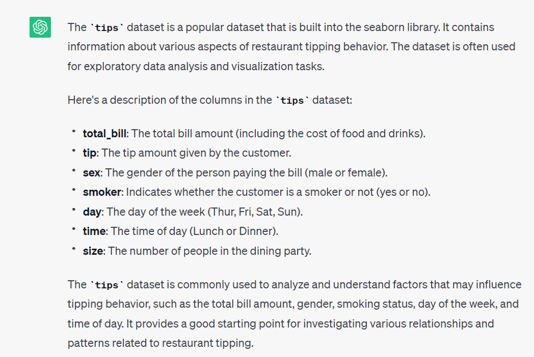
Prompt: Tell me more about the `tips` dataset built into the seaborn library.
Knowing what the dataset is about is a good starting point. Let's start by doing the following:
- Load the dataset into a pandas dataframe, and
- Get basic info and summary statistics of the columns to understand more about the dataset.
Prompt: Let’s use the `tips` dataset. Write the code to read the dataset into a pandas dataframe and get the basic info and summary statistics of the available fields.
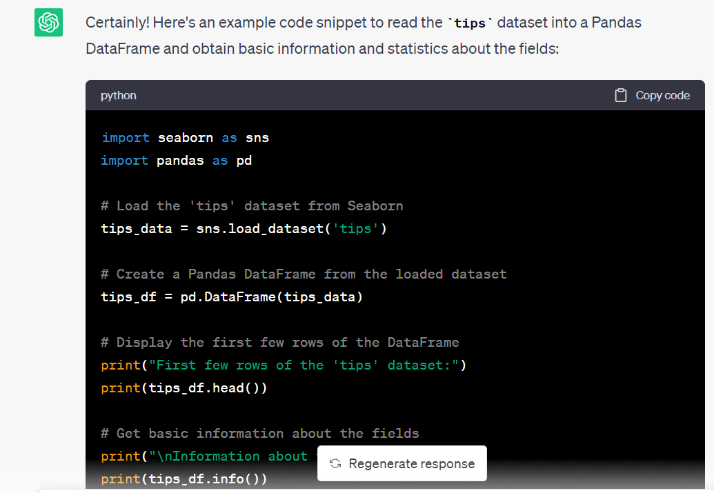
import seaborn as sns import pandas as pd # Load the 'tips' dataset from Seaborn tips_data = sns.load_dataset('tips') # Create a Pandas DataFrame from the loaded dataset tips_df = pd.DataFrame(tips_data) # Display the first few rows of the DataFrame print("First few rows of the 'tips' dataset:") print(tips_df.head()) # Get basic information about the fields print("nInformation about the 'tips' dataset:") print(tips_df.info()) # Get summary statistics of the numeric fields print("nSummary statistics of the numeric fields:") print(tips_df.describe())We see that we have quite an informative summary of the dataset:
First few rows of the 'tips' dataset: total_bill tip sex smoker day time size 0 16.99 1.01 Female No Sun Dinner 2 1 10.34 1.66 Male No Sun Dinner 3 2 21.01 3.50 Male No Sun Dinner 3 3 23.68 3.31 Male No Sun Dinner 2 4 24.59 3.61 Female No Sun Dinner 4 Information about the 'tips' dataset: RangeIndex: 244 entries, 0 to 243 Data columns (total 7 columns): # Column Non-Null Count Dtype --- ------ -------------- ----- 0 total_bill 244 non-null float64 1 tip 244 non-null float64 2 sex 244 non-null category 3 smoker 244 non-null category 4 day 244 non-null category 5 time 244 non-null category 6 size 244 non-null int64 dtypes: category(4), float64(2), int64(1) memory usage: 7.4 KB None Summary statistics of the numeric fields: total_bill tip size count 244.000000 244.000000 244.000000 mean 19.785943 2.998279 2.569672 std 8.902412 1.383638 0.951100 min 3.070000 1.000000 1.000000 25% 13.347500 2.000000 2.000000 50% 17.795000 2.900000 2.000000 75% 24.127500 3.562500 3.000000 max 50.810000 10.000000 6.000000From the summary statistics, we have an idea of the numerical features in the dataset. We know the minimum and maximum values, mean and median values, and percentile values for the numerical features. There are no missing values so we can proceed with the next steps.
Exploring the Dataset – The What, the Why, and the How
Now that we have an idea of the dataset, let's go further.
The goal of this exploratory data analysis is to understand the tipping behavior better. For this we can come up with helpful visualizations. These should help us understand the relationship of the tip amount to the various categorical variables in the dataset.
Because this is a simple dataset to analyze, let's prompt ChatGPT to give us a set of steps to go about analyzing this data set further.
Prompt: The goal of the analysis is to get some insights into the tipping behavior, starting with some simple visualizations. Suggest steps for the same.
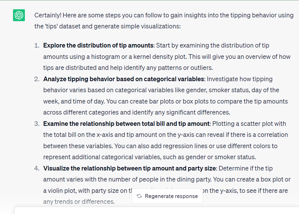
The data exploration steps suggested by ChatGPT all seem valid. So we will use these steps—to better understand a dataset—one step at a time. We’ll prompt ChatGPT to generate code, try to run the generated code, and modify them as needed.
Exploring the Distribution of Tip Amounts
As a first step, let's visualize the distribution of the tip amount prompt.
Prompt: Write the code to plot the distribution of tip amounts.
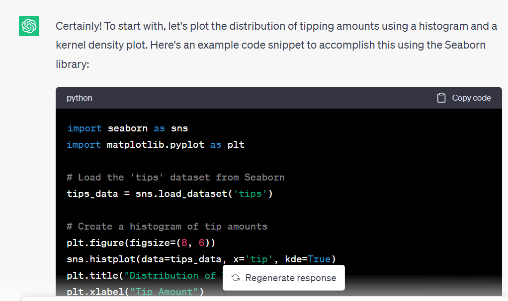
ChatGPT gave the following code to generate a histogram and a kernel density plot that help us get an idea of the distribution of the tip amounts:
import matplotlib.pyplot as plt # Create a histogram of tip amounts plt.figure(figsize=(8, 6)) sns.histplot(data=tips_data, x='tip', kde=True) plt.title("Distribution of Tip Amounts") plt.xlabel("Tip Amount") plt.ylabel("Frequency") plt.show()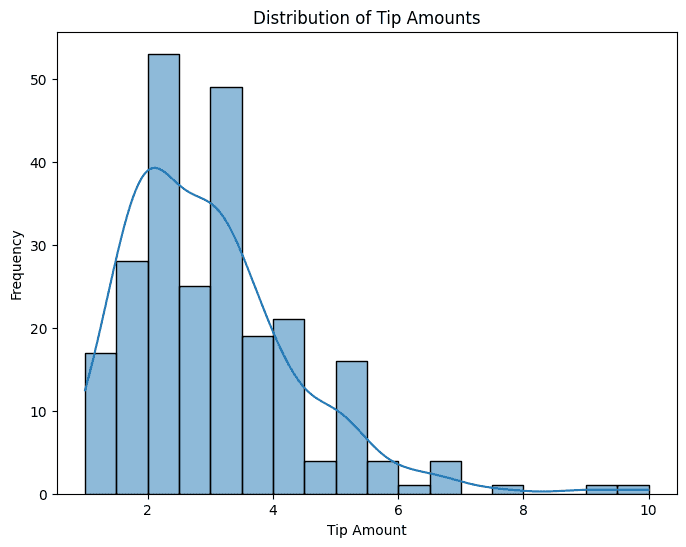 Analyzing Tipping Behavior Based on Categorical Variables
We have many categorical variables in the dataset. It will help to have a simple bar plot showing the average tip amount for the different values of these category variables.
Prompt: Use all the available categorical variables (‘sex’, ‘smoker’, ‘day’, and ‘time’). Write the code to generate bar plots to understand tipping behavior. Use subplots so we can have all the four bar plots in a single figure.
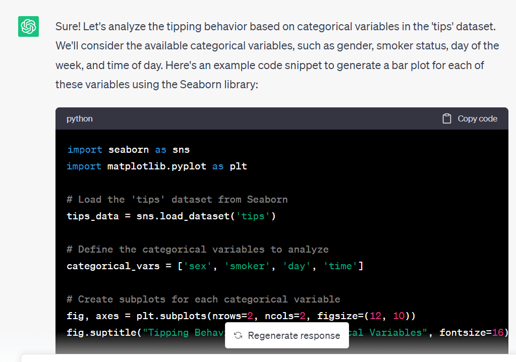
And here’s the code. The code ran without errors; I only had to modify the figure size:
# Define the categorical variables to analyze categorical_vars = ['sex', 'smoker', 'day', 'time'] # Create subplots for each categorical variable fig, axes = plt.subplots(nrows=2, ncols=2, figsize=(8, 5)) fig.suptitle("Tipping Behavior based on Categorical Variables", fontsize=16) # Generate bar plots for each categorical variable for ax, var in zip(axes.flatten(), categorical_vars): sns.barplot(data=tips_data, x=var, y='tip', ax=ax) ax.set_xlabel(var.capitalize()) ax.set_ylabel("Average Tip Amount") plt.tight_layout() plt.show() 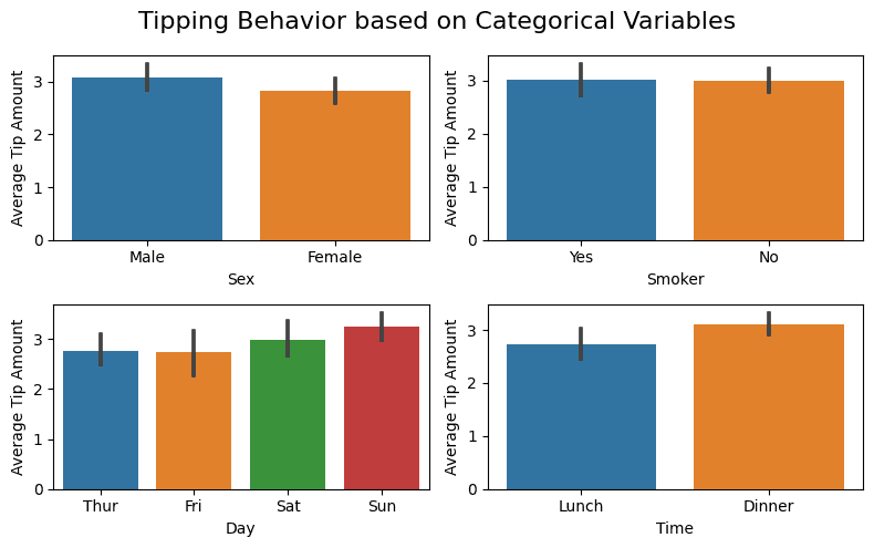
From the plots, we see that features like sex and smoking behavior don’t influence tipping behavior (which is expected). While days and times seem to. The average tip amount on weekends and dinner seem to be slightly higher.
Visualizing the Relationship Between Total Bill and Tip Amount
Now, let’s see how the total bill influences the tip amount paid.
Prompt: I’d like to understand the relationship between total bill and the tip amount. Please give me the code to generate a suitable plot for this. I believe a simple scatter plot will be helpful.
Here’s the code to generate the required scatter plot:
# Create a scatter plot of total bill vs. tip amount plt.figure(figsize=(6, 4)) sns.scatterplot(data=tips_data, x='total_bill', y='tip') plt.title("Total Bill vs. Tip Amount") plt.xlabel("Total Bill") plt.ylabel("Tip Amount") plt.show() 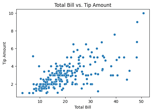
We see that there’s some positive correlation between the total bill and the tip amounts.
Visualizing the Relationship Between Party Size and Tip Amount
As a next step, let’s try visualizing the relationship between the party size and the tip amount.
Prompt: Now, I'd like to understand how the tip amount varies with the number of people who dine (party size). Which is a better choice: a bar plot or a violin plot?
As we’d also like to understand the distribution of the tip amounts, let’s go ahead with creating a violin plot.
Prompt: Cool! Please write the code to generate a violin plot for this visualization.
And here’s the code:
# Create a violin plot for tip amount by party size plt.figure(figsize=(6, 4)) sns.violinplot(data=tips_data, x='size', y='tip') plt.title("Tip Amount by Party Size") plt.xlabel("Party Size") plt.ylabel("Tip Amount") plt.show()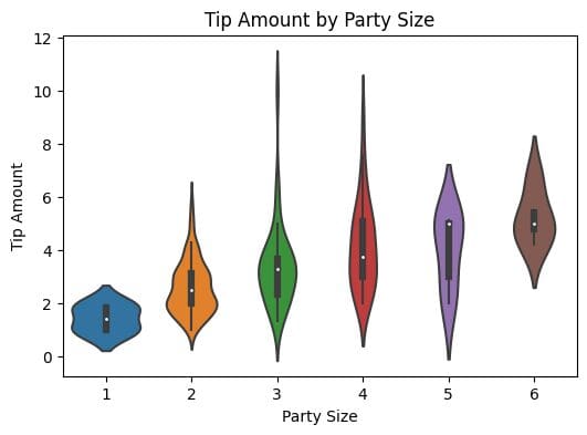 Understanding Tipping Behavior Based on Both Time and Day
Next, let’s understand how the time and the day influence the tipping behavior.
Prompt: I want to understand how the tipping behavior varies depending on both time and day. What is a good visualization? Also, write the code to generate the required visualization.
This code snippet shows how to pivot using the day as the index and aggregate the mean value of the tip amounts for lunch and dinner (the time of the day):
# Create a pivot table of average tip amount by time and day pivot_table = tips_data.pivot_table(values='tip', index='day', columns='time', aggfunc='mean') # Create a heatmap of tipping behavior based on time and day plt.figure(figsize=(8, 6)) sns.heatmap(pivot_table, cmap='YlGnBu', annot=True, fmt=".2f", cbar=True) plt.title("Tipping Behavior based on Time and Day") plt.xlabel("Time") plt.ylabel("Day") plt.show() 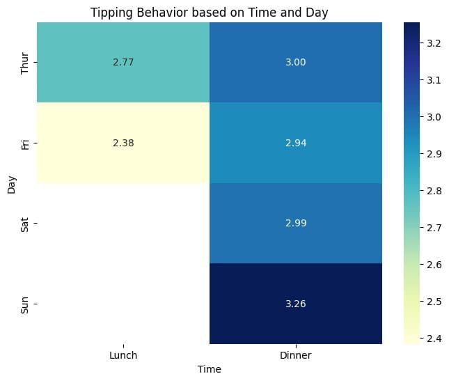
From the heat map, we see that the average tip amounts are marginally higher for dinner on Sunday than other time-day pairs. In general, for a given day, on an average, tip amounts for dinner seem to be higher than those for lunch.
We also see that there is not enough data for lunch on Saturdays and Sundays. Because we only have a total of 244 records, we may not have any record for lunches on weekends. Let’s go ahead and verify this.
Prompt: I want to get the number of parties who ordered lunch on weekends. Write the code to filter the `tips_data` dataframe and get this count.
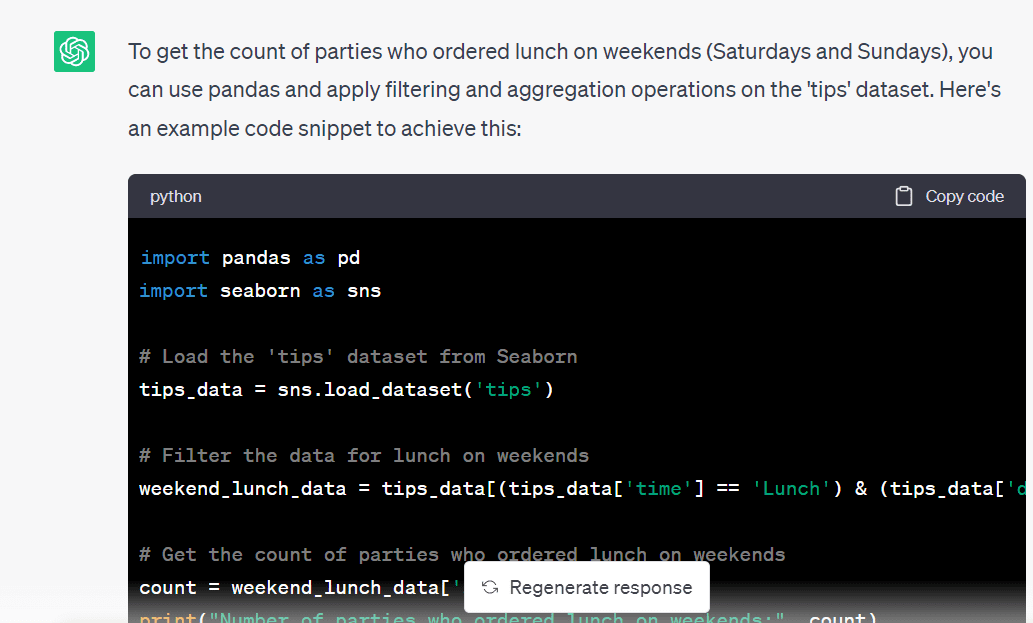
Here’s the code to filter the dataframe and obtain a subset containing the records for lunches on weekends:
# Filter the data for lunch on weekends weekend_lunch_data = tips_data[(tips_data['time'] == 'Lunch') & (tips_data['day'].isin(['Sat', 'Sun']))] # Get the count of parties who ordered lunch on weekends count = weekend_lunch_data['size'].count() print("Number of parties who ordered lunch on weekends:", count)And we see that we don’t have any records for the same, so our analysis is correct thus far:
Number of parties who ordered lunch on weekends: 0And that’s a wrap! We explored the `tips` dataset and generated some helpful visualizations by prompting ChatGPT.
Wrapping Up
In this article, we learned how to leverage ChatGPT for data exploration. If you’re interested in integrating ChatGPT into your data science workflow, check out this guide. It walks through an example project—along with tips and best practices—to effectively use ChatGPT for data science experiments.
Bala Priya C is a developer and technical writer from India. She likes working at the intersection of math, programming, data science, and content creation. Her areas of interest and expertise include DevOps, data science, and natural language processing. She enjoys reading, writing, coding, and coffee! Currently, she's working on learning and sharing her knowledge with the developer community by authoring tutorials, how-to guides, opinion pieces, and more.
- I Used ChatGPT (Every Day) for 5 Months. Here Are Some Hidden Gems That…
- Unlock your next move: Save up to 67% on in-demand data upskilling
- Speeding up data understanding by interactive exploration
- 7 AI-Powered Tools to Enhance Productivity for Data Scientists
- Building a Visual Search Engine – Part 1: Data Exploration
- SAS® Visual Data Science Decisioning powered by SAS® Viya®:…