
If you, your team or your company design and deploy AI architecture, data pipelines or algorithms, having great diagrams to illustrate the workflow is a must. It is a critical piece of documentation. You can also include it in marketing material or to raise funding. Creating diagrams can be time consuming. Here I discuss my experience as a novice. It will resonate well with busy professionals such as CTOs, with little time and possibly — like myself — limited experience playing with tools such as Canvas or Mermaid.
In my role, I build architectures all the time. Yet, I produce few diagrams. I know how to produce great ones in LaTeX or with Python libraries, but the process is slow. Thus, I sometimes ask team members to produce them. I also paid designers in the past to do it. Still, explaining a new architecture and working with a partner to do the flowcharts takes many hours. Also, the result may not be as expected: these diagrams require frequent updates.
So, I decided to take the plunge and do it myself. While the result in Figures 1 and 2 may look great, I am unsatisfied. I spent days working with a tool that was supposed to be straightforward: Mermaid. Here I explain the problems, potential solutions, and discuss how you could use GenAI to produce these graphs much faster with better quality.
Case Study: LLM/RAG Diagram
The two diagrams in Figures 1 and 2 come from my new article “Custom Enterprise LLM/RAG with Real-Time Fine-Tuning”, available here. I played with Mermaid online editor but quickly realized that I would be better off writing my own Mermaid code: it is a mix of JavaScript and Markdown, pretty standard and straightforward to represent graphs. But the learning curve is steep for anything other than a simple flowchart. My diagrams involve multiple layers of sub-graphs, and non-standard fonts and colors. The complexity is not due to the diagram itself, but due to multiple glitches, counter-intuitive mechanisms, and bugs in Mermaid. I will discuss them in the next sections. You can use Mermaid GenAI to produce AI-generated diagrams, but I did play with this option, thinking I would face even more problems.
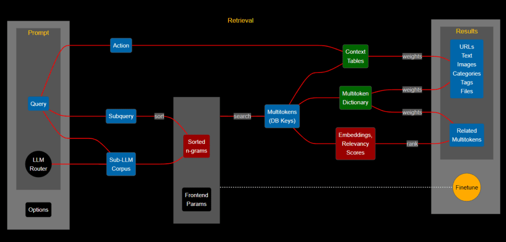
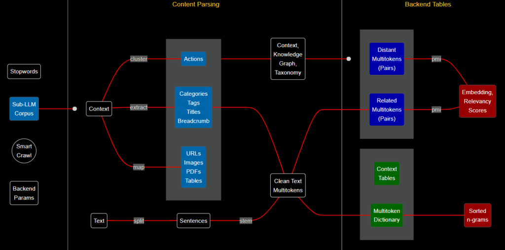
The code for Figures 1 and 2 is on GitHub, respectively here and here. See below the code for the back-end diagram. It looks a bit long, but this is actually the easy part. There is quite a bit of documentation on Mermaid to help you. Some users claim that it can only do basic stuff, unable for instance to format titles as you wish. Somehow, I managed to do it (yellow titles), even though it is not documented anywhere. All of this with the free version. The last 14 lines draw the connecting lines in red. The real problem is properly rendering the code, an internal Mermaid issue. I discuss it in the next section.
flowchart LR %%{init: {'theme':'dark'}}%% A3("Stopwords") A("Sub-LLMnCorpus") A1("SmartnCrawl") A2("BackendnParams") D1("Clean TextnMultitokens") D("Sentences") B("Context") J("Actions") K("DistantnMultitokensn(Pairs)") K2("RelatednMultitokensn(Pairs)") M("Embedding,nRelevancynScores") N("Sortednn-grams") R("URLsnImagesnPDFsnTables") S("Context,nKnowledgenGraph,nTaxonomy") W("ContextnTables") H("MultitokennDictionary") CT("CategoriesnTagsnTitlesnBreadcrumb") Z("Text") X(" ") X3(" ") X4(" ") subgraph head [ ] X4 A3 A A1 A2 end subgraph major ["Content Parsing"] X3 subgraph init [ ] B Z end Z -- split --- D subgraph box1 [ ] subgraph yellow3 [ ] J CT R end D end subgraph grey [ ] D1 S end end subgraph final ["Backend Tables"] X subgraph orange [ ] subgraph pairs [ ] K K2 end subgraph ctx [ ] W H end end subgraph green [ ] M N end end A --o init yellow3 --- S B -- map --- R CT --- D1 B -- extract --- CT D1 --- K2 K -- pmi --- M K2 -- pmi --- M S --o orange D1 --- H H --- N B -- "cluster" --- J D -- stem --- D1 style K fill:#0000aa,color:#ffffff,stroke:#555555 style K2 fill:#0000aa,color:#ffffff,stroke:#555555 style W fill:#006600,color:#ffffff,stroke:#555555 style H fill:#006600,color:#ffffff,stroke:#555555 style N fill:#990000,color:#ffffff,stroke:#555555 style M fill:#990000,color:#ffffff,stroke:#555555 style CT fill:#0066aa,color:#ffffff,stroke:#555555 style R fill:#0066aa,color:#ffffff,stroke:#555555 style J fill:#0066aa,color:#ffffff,stroke:#555555 style D fill:#000000,color:#ffffff,stroke:#ffffff style A fill:#000000,color:#ffffff,stroke:#ffffff style A1 fill:#000000,color:#ffffff,stroke:#ffffff style A2 fill:#000000,color:#ffffff,stroke:#ffffff style A3 fill:#000000,color:#ffffff,stroke:#ffffff style B fill:#000000,color:#ffffff,stroke:#ffffff style Z fill:#000000,color:#ffffff,stroke:#ffffff style S fill:#000000,color:#ffffff,stroke:#ffffff style D1 fill:#000000,color:#ffffff,stroke:#ffffff style X4 fill:#000000,height:92px,font-size:0,stroke-width:0px style X3 fill:#000000,height:0px,font-size:0,stroke-width:0px style X fill:#000000,height:32px,font-size:0,stroke-width:0px style head fill:#000000,width:189.9px,height:692px,stroke:#000,stroke-width:0px,font-size:15px style major fill:#000000,width:750px,height:692px,stroke:#000,stroke-width:0px,font-size:15px style final fill:#000000,width:450px,height:692px,stroke:#000,stroke-width:0px,font-size:15px style yellow3 stroke:#ffffff style pairs stroke:#ffffff style ctx stroke:#ffffff style init fill:#000000,stroke:#000,stroke-width:0px,font-size:15px style box1 fill:#000000,stroke:#000,stroke-width:0px,font-size:15px style grey fill:#000000,stroke:#000,stroke-width:0px,font-size:15px style green fill:#000000,stroke:#000,stroke-width:0px,font-size:15px style orange fill:#000000,stroke:#000,stroke-width:0px,font-size:15px linkStyle 0 stroke:#FF0000,fill:none linkStyle 1 stroke:#FF0000,fill:none linkStyle 2 stroke:#FF0000,fill:none linkStyle 3 stroke:#FF0000,fill:none linkStyle 4 stroke:#FF0000,fill:none linkStyle 5 stroke:#FF0000,fill:none linkStyle 6 stroke:#FF0000,fill:none linkStyle 7 stroke:#FF0000,fill:none linkStyle 8 stroke:#FF0000,fill:none linkStyle 9 stroke:#FF0000,fill:none linkStyle 10 stroke:#FF0000,fill:none linkStyle 11 stroke:#FF0000,fill:none linkStyle 12 stroke:#FF0000,fill:none linkStyle 13 stroke:#FF0000,fill:none For the story, I did not “paint” the titles “Content Parsing” and “Backend Tables” in yellow in the above code snippet. It’s standard HTML code specifying the font and color. But WordPress (the Data Science Central publishing platform) somehow interpreted it as a command to change the font and color even though it is in a code block. I guess in the same way that Mermaid did, turning the titles into yellow even though there is no way to do it. It’s actually a bug both in WordPress and Mermaid, but one that you can exploit to do stuff otherwise impossible to do. Without that hack, in Mermaid the title would be black on a black background, so invisible (the default background is white, and things are harder if you choose the dark theme).
I posted a very high resolution of the diagrams in the original technical document. This WordPress version does not do justice to Mermaid.
Problems and Potential Solutions
In this section, I discuss the challenges that I faced. Then I discuss potential solutions. The main problems are:
- The flowchart consists of main blocks from left to right. Sub-blocks within each main block are oriented from top to bottom. It is impossible to predict when Mermaid will respect this constraint, and when it will overwrite it. Sometimes adding a single letter to a title is enough to screw everything up, making the output especially ugly. I had to add 3 invisible fake nodes of the right size, labeled X, X3, X4 in the code, to maintain the desired structure. Their font color is black, on a black background, thus invisible.
- Arrows (the red connecting lines) are too long despite choosing the smallest length. I am not sure if you can fix this.
- Sometimes the diagram looks fine on the UI, but once you save it as an image, it looks bad. You can make it look bad on the UI in such a way that it will look good on the output image, by trials and errors. Getting the main blocks aligned is challenging: you need to add extra spaces.
- The nodes within a sub-block must be specified in the right order in the code. Otherwise, the red lines cross each other, and the resulting diagram looks like spaghetti. But the right order to eliminate crisscrossing is not always respected by Mermaid.
All these problems are not unique to Mermaid. But after spending 3 days producing these rather simple diagrams, I came to this conclusion: it would have been easier for me to write some Python code that accepts the above Mermaid code as input and turns it into nice diagrams with Matplotlib. Automatically positioning the objects at the best location, reordering the nodes as needed, to avoid crisscrossing and produce perfect alignment. I am not sure whether there is some diagram tool that does that. Any other tool that I tried — some allowing you to specify object positions — do a poor job at automatically organizing the blocks, sub-blocks and connectors. I will do some research, and you are happy to mention better solutions. But if I don’t find any, it’s a 2-day project for me to do it from scratch.
I recommend looking at the GraphViz library. It is supposed to do a better job. Though the first step — installing it — is not straightforward. I also discussed the issue with my 17 years old son. He came up with a solution in pure HTML in no time, though not as fancy as my diagrams.
About the Author

Vincent Granville is a pioneering GenAI scientist and machine learning expert, co-founder of Data Science Central (acquired by a publicly traded company in 2020), Chief AI Scientist at MLTechniques.com and GenAItechLab.com, former VC-funded executive, author (Elsevier) and patent owner — one related to LLM. Vincent’s past corporate experience includes Visa, Wells Fargo, eBay, NBC, Microsoft, and CNET. Follow Vincent on LinkedIn.