Sponsored Post
View Time Series Ratio Analysis Dashboard samples, and learn how to build a web-based, interactive, time series ratio analysis dashboard on your own business ratios in four easy steps.
Whether you are analyzing growth rate, market share or debt-to-equity, identify and graph positive or negative trends among customers, stores, product SKUs, departments, or sales channels.
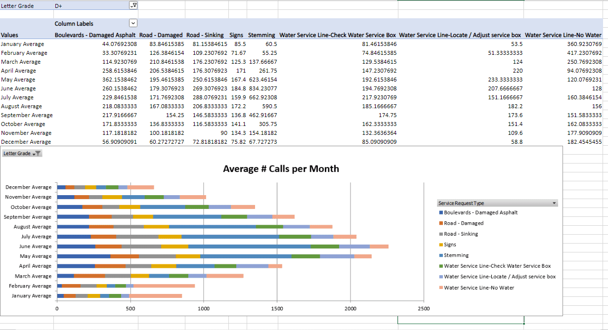
Once you have summarized your key ratios data across a 12-month period, import or paste it into the TIME SERIES Outlier and Anomaly Detection Template and click the 'Time Series Boxplot Analysis!' button. Read 311 Call Centre Performance: Rating Service Levels for an example of this time series analysis template used on call centre ratios.
You will automatically see a chart on the 'Chart' worksheet tab that summarizes your key ratio trends so you can visualize segments that require your attention. Click the 'Data' worksheet tab to see how the template analyzed your data and created the chart.
View the FREE SAMPLE OUTPUT – TIME SERIES Outlier and Anomaly Detection Template for an example of the output you will receive by using the TIME SERIES Outlier and Anomaly Detection Template.
Analyze and find trends for key ratios that drive your business. And, don't forget to also try the FREE Ratio Analysis Template available on KDNuggets.
- Create Synthetic Time-series with Anomaly Signatures in Python
- Mastering Time Series Analysis with Help From the Experts
- Codeless Time Series Analysis with KNIME
- Multivariate Time Series Analysis with an LSTM based RNN
- Market Data and News: A Time Series Analysis
- Multidimensional multi-sensor time-series data analysis framework